Cloud Service Models (IaaS, PaaS, SaaS) Diagram
Guessing most of us have seen a version of the diagram that compares the cloud computing service models (IaaS, PaaS, SaaS) and on-premises environments, sometime within the past few years? You know, the one that uses a visualization of four software (layer cake) stacks to describe the differences between infrastructure, platform, and software “-as-a-service” models as described in The NIST Definition of Cloud Computing?
This is the (boring) story/recap of how this diagram came to be. 😉
2008: Hello, Azure
At the time of this writing, it is almost 10 years since the initial announcement of Microsoft Azure (at that time named “Windows Azure”), by Ray Ozzie at the Microsoft Professional Developers Conference 2008 (PDC08) on October 27, 2008. If you recall, at that time this is something almost inconceivable for Microsoft to do. Afterall, only the cool kids on the block, Amazon and Google, seemed to be interested in cloud computing. Plus, take into account of the observation that a subscription-based revenue model potentially cannibalizes many of Microsoft’s existing license-based products.
After the announcement, there was a tremendous amount of interest in the community to learn about Azure. According to my notes, I alone had more than 300 meetings with organizations of all sizes in a 6-month period following the announcement.
Needless to say, presentation slides were a big part of my work at the time, as visual aids helped to explain many concepts and details, and facilitate the conversations. In one of the slide decks I used, there was this diagram (can be found on Slideshare dated Nov. 19 2008):
This was used to explain the platform-as-a-service (PaaS) approach Azure implemented. If you recall, Azure at that time only had Web Roles and Worker Roles (classic cloud services as categorized today) as primary compute options. These being services that operate in the PaaS model, we needed to rationalize/justify the fundamental differences in the PaaS model, relative to how people understood on-premises IT at the time. This diagram helped to articulate the major trade-offs between the well-known models at the time: on-premises, outsourced hosting, and the (new) public cloud environments.
2009: Concept Formation
The first diagram succinctly highlighted the major differences and helped people recognize that PaaS is different from outsourced hosting and on-premises IT. But it only addressed the topic at a surface layer; we often ended up spending more time discussing how and why PaaS is different - not just with on-premises, but IaaS as well. So we needed a different visualization to help support that part of the conversation.
We needed a diagram/graphic/model, or visual representation, that:
- is simple and easy to understand (basically at first glance)
- highlights the differences in a context that is familiar (relative to the similarities)
- conveys the value of ‘managed’ services (we worry about some things so you don’t have to)
- articulates the degree of differences (that one is more different than same)
The approach we took landed in a visual representation of existing on-premises IT environments, and the cloud service models mapped in the same context, so that the differences can be highlighted in the context of the commonalities (as opposed to explicitly stating them in words in the earlier diagram). Thus the 9-layers stack view was developed, using common, high-level IT infrastructure domains that can be carried consistently across all of the models. The specific layers were chosen as they exemplify some levels of separation of concerns, and to imply a traditional IT stove pipe stack representation, with some direct dependencies between stack layers, or design/operational abstractions.
After a few iterations, this view was developed, first published on my MSDN blog (dated Jan. 13 2009):
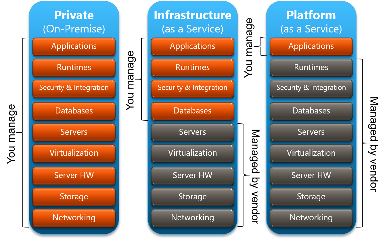
The visual design implied that:
- On-premises is as we understand it: we have full control over the entire stack as we own and manage them
- IaaS is different from on-premises (even though it technically runs on the same stack), but it is also different from outsourced managed hosting
- PaaS is really different!
(as a side note) The inter-layer dependency and separation of concern aspect is often lost when trying to use other models to visualize this stack relationship, such as pizza-as-a-service and car-as-a-service. To me these analogies make the diagram more interesting, but they ended up missing an important part of the context.
And the use of hot coloring (red slices) vs. cool coloring, and number of layers highlighted per model, were all intended to visually call out, and illustrate the scale in differences (e.g., on-premises has 9 red layers, IaaS has 4, and PaaS has just 1 - suggesting that they are more different than they are similar; oh, and PaaS is more ‘cool’).
As this view gained traction, a version of it was published on Slideshare (dated Jun 9 2009). Along with this car analogy which mapped to the same 3-column structure to help people relate to the impact of the differences in these models.

The high-level talking points for this analogy were:
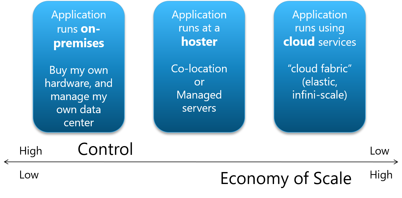
- On-premises: is like owning your cars - you can go anywhere you want at anytime (full control), in a car make/model/color/trim of your choice, but you own the car and you’re responsible for its maintenance
- IaaS: is like a car rental service - you still can go anywhere you want at anytime, with some limits in car choices, but you don’t have to maintain the vehicles; just take the keys and go
- PaaS: is like public transportation - you can go to places as defined/limited by available routes and schedules, but it’s easy to use and pay-per-use (full economies of scale)
Fundamentally, this still mapped to the initial high-level trade-offs messaging between ‘control’ and ‘economy of scale’, but it is now visually easier to understand and helps facilitate a more engaging discussion during a presentation.
For the following months, from a visual design perspective, there was a shift starting to move away from rich, 3D looking graphics (e.g., boxes with gradients, lighting, bevels, borders, corners, shadows, effects, etc.) towards a flatter, simpler design. This diagram was also updated to reflect those trends (Slideshare (dated Oct 17, 2009)); now with less complex objects (less visual noise), and fewer colors (a simpler palette).
2010: Full Realization
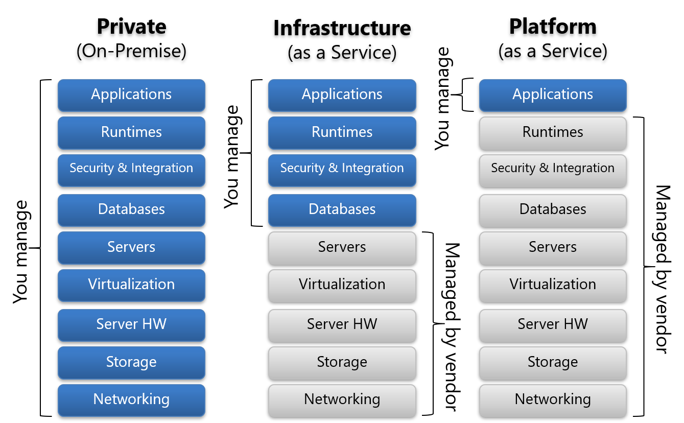
By this time many people have seen this diagram, as its usage proliferated publicly, and within Microsoft, when we went “all-in” with the cloud, and the armies of Microsoft employees and partners started blogging and presenting about Azure. Among the many feedback received, was one from Scott Kerfoot, who suggested to add a fourth column to represent Software-as-a-service (SaaS).
Adding SaaS required us to modify the model a bit, especially as we needed to differentiate PaaS and SaaS, because it didn’t work to have just one layer of difference between the two, and we still needed to keep the scales of differences between the models relatively consistent. Thus “Security & Integration” was removed as security concerns exist at all layers, and added “Data” underneath “Applications”. Then “Databases”, “Servers”, and “Server HW” were changed to “Middleware”, “O/S”, and “Server”; respectively.
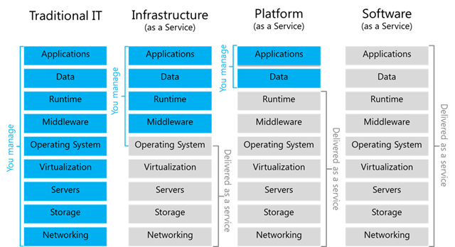
And then this view was created (dated Jan. 15 2010), with a consistent 2-layer difference between SaaS, PaaS, and IaaS; and a 5-layer difference between IaaS and on-premises to express that cloud environments are more different from on-premises environments.
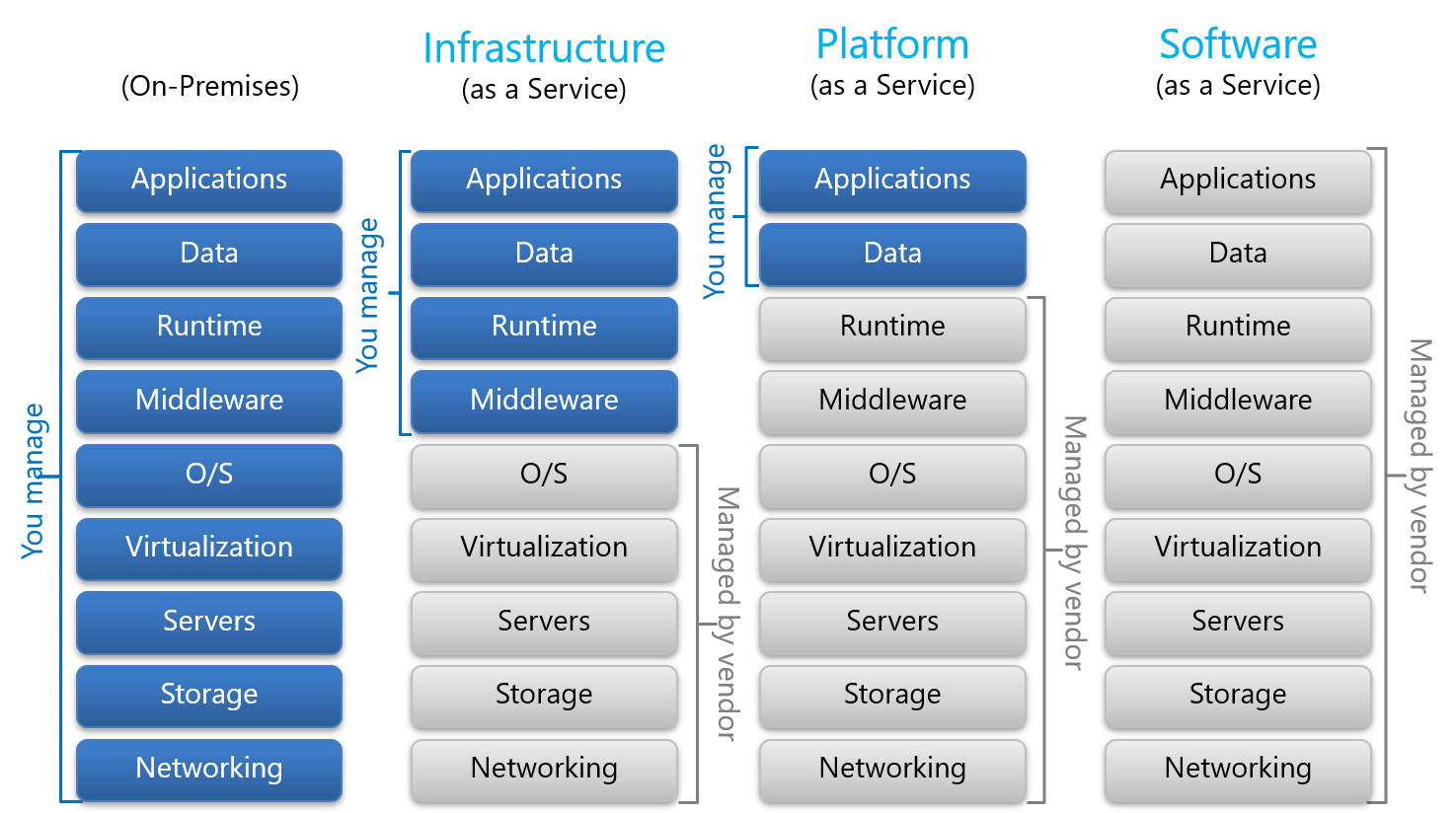
And then further flattening and simplifying the graphic design of the diagram, plus a few minor edits, such as changing “O/S” to “Operating System”, and “On-Premises” to “Traditional IT” (as on-premises also included private cloud context so we needed to differentiate from that), and slightly adjusting the ‘managed by’ lines to express a shared responsibility view for O/S in IaaS (cloud vendors provide the base VM image, but customers still need to maintain its patching and updates, etc.), we reached the final version shown below (same as the one at the top of this post).
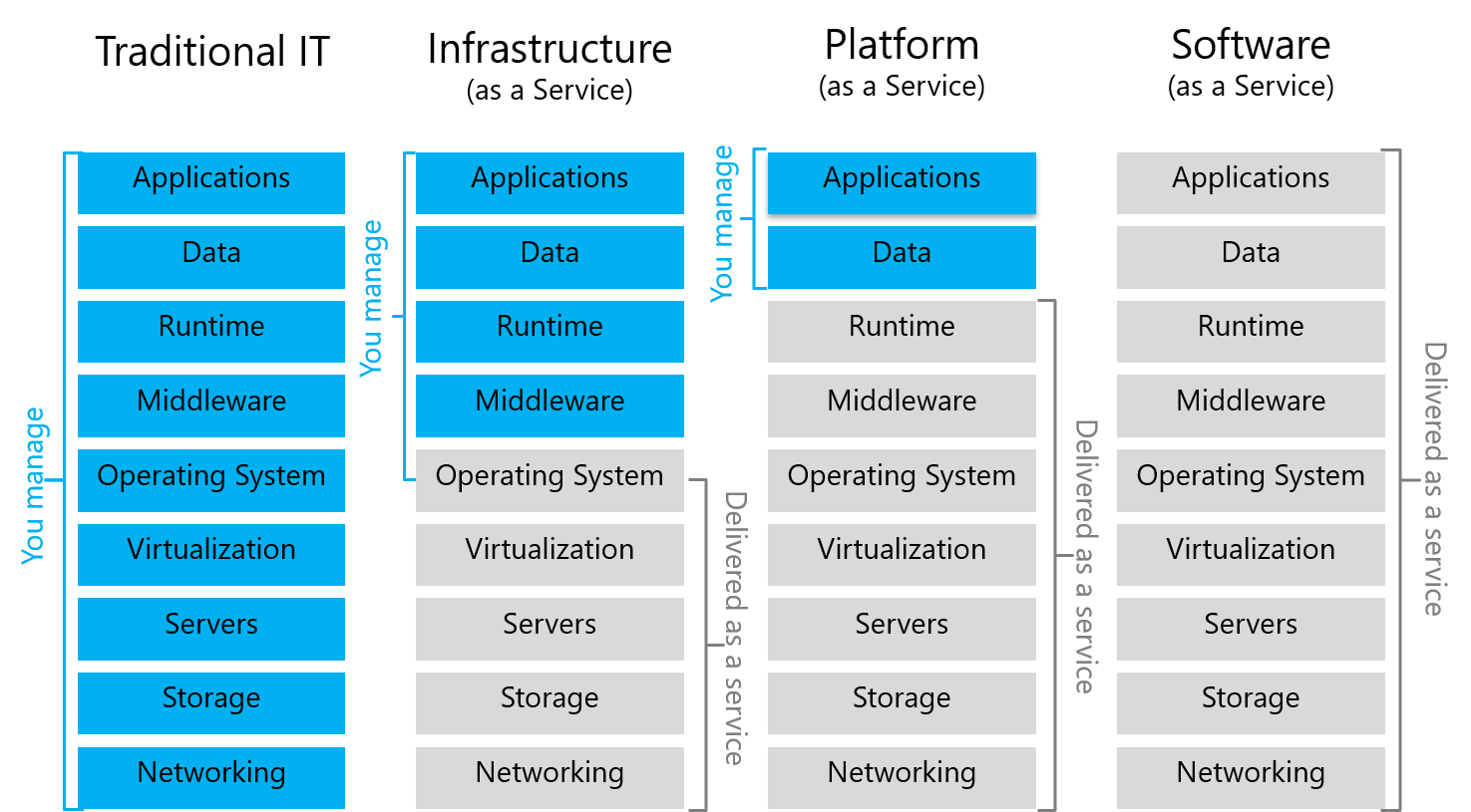
These versions were published and propagated via many sources, and as my presentation decks were mostly incremental technical detail updates, they were not published to avoid too much duplication (since I already have too many Azure overview decks on Slideshare). It was later in 2011 when I wrote about cloud ecosystems this final version was referenced.
Today
Progress moves fast in this industry. Conversations soon shifted from explaining and justifying PaaS, towards primarily deeper discussions and engagements about real development projects. Lines between IaaS and PaaS started to blur even before Azure made Virtual Machines available in 2012 (Azure had VM Roles since 2010 but it’s not exactly IaaS). It was increasingly more about composing capabilities into cloud projects, regardless which ‘cloud model’ was used by a particular implementation (e.g., API, component, feature, service, etc.). Application projects were composing services and features built on both IaaS and PaaS options. It was no longer IaaS or PaaS; it was IaaS AND PaaS AND SaaS. Furthermore, there was increasing maturity around hybrid cloud approaches so even the lines with on-premises environments were blurring.
Hence this diagram was no longer part of my standard cloud computing presentations. However, it continues to be referenced and used widely in cloud computing literature in many forms. Some of the core content has been updated frequently over the years, but it’s interesting to see how this diagram is still being used by people today.
A simple image search on “iaas paas” would yield hundreds of hits from all kinds of sources around the world, and many kinds of variations and flavors, and in different languages. Some people claimed to have created this view, some credited “the Internet”; though most of the time it is just a visual with no source mentioned. It’s kind of fascinating to see how this unit of work took on a life of its own.